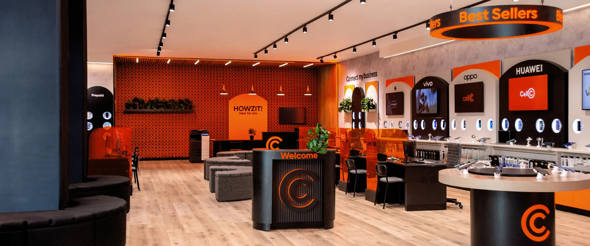
Cell C is committed to championing the needs of the people it serves. By placing the brand’s purpose – to be an ally to those we serve – at its core we relooked and rebuilt its identity externally and internally to reclaim its challenger status.
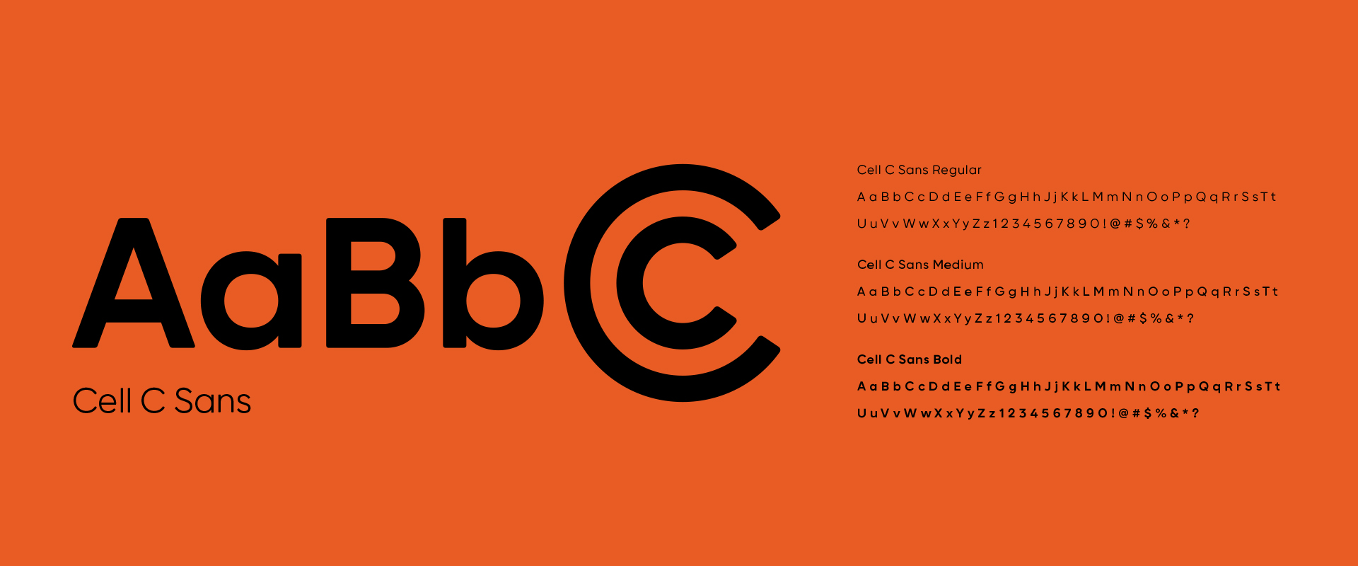
Deeply rooted in the brand’s heritage we crafted an open double C icon that speaks to partnership and human centricity along with an approachable bespoke font that creates connection. A powerful black and orange colour palette aligns with the brand’s edginess. Simplifying and modernising the brand while reigniting its recognised and beloved feistiness. Raising up an icon, a truly and authentically local brand, relaunched to disrupt the market.